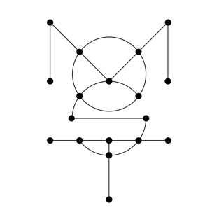
“The name OPPO consists of two different letters (O and P) and of four letters in total. I wanted to create something that matched the simplicity of this name. The pattern of the name OPPO is ABBA. Furthermore, the O and the P are next to each other in the alphabet so this structure was something I wanted to use in the sound logo too. I translated this to musical notes. The notes of the sound logo thus also had to be next to each other on the musical scale and according to the same ABBA pattern. I choose the note E and the D and with the ABBA pattern led to a melodie of EDDE. And here we have an easy to recognise four note sound logo for the brand.” –
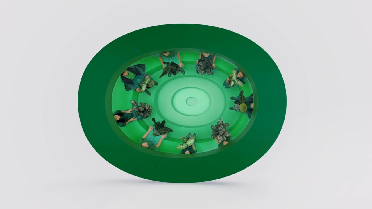
Director: Lernert Engelberts
DOP: Julien Andreetti
Executive Producer: Maarten Le Roy + Ay Wei Wong
Producer: Charles Kinoo
Film Production Company: @Adult Adult + The Pandemic Story
Production Design: Pepijn Van Looy (Tanker)
Styling: Thomas Vermeer
Music: Diederik Idenburg @ MOST___original soundtracks___audio post
Post Production: Glassworks Amsterdam
Creative Agency: forsman & bodenfors
Chief Creative Officer: Jon Ip
Creative Director: Sherry Shi


在T站说说你的看法~